Tim Hortons Theoretical Rebrand
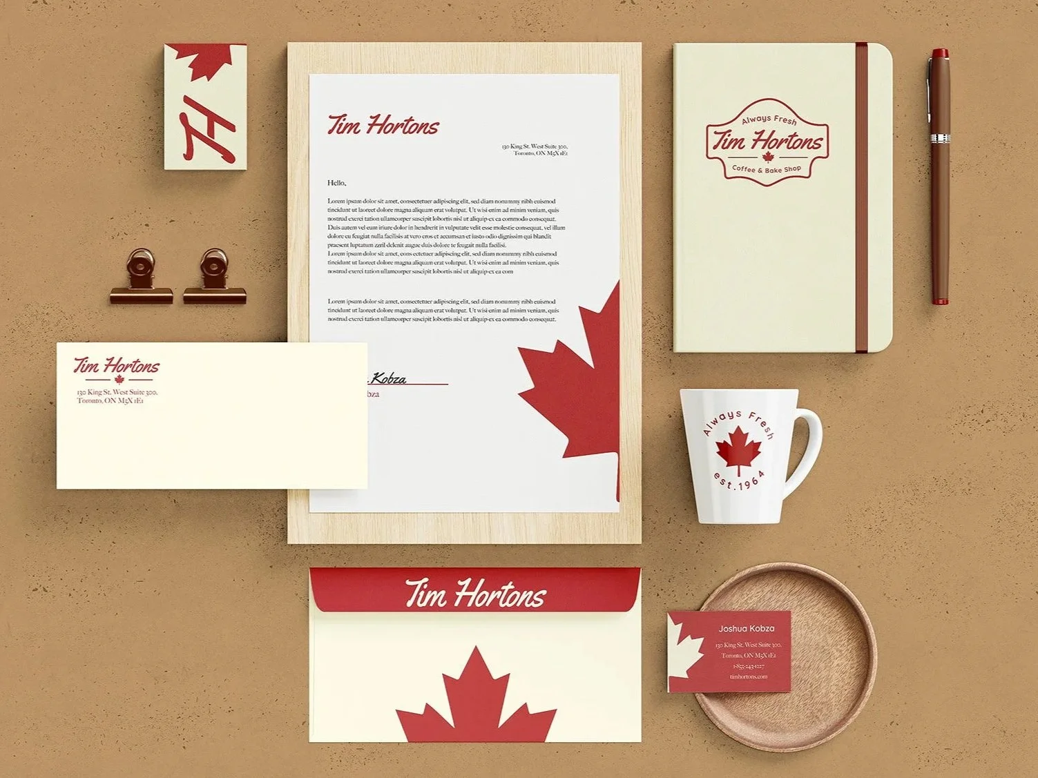


This was a group project that proposed the idea of rebranding Tim Hortons. I created the emblem logo for this project, designed the coffee display, and designed the stationary set. For the logo, we chose a font that was similar to the current one but is more modern and revamped the emblem shape. For the set, I decided to play with the leaf form by cutting it in half to keep the brand identity and allow more space to be used. One of my group members designed the monogram that is used on the business card.